Red vs. Blue: The Battle of Colors in Investment Marketing

The most-quoted statistic in writing about color psychology in marketing is that color drives 85% of consumer purchasing decisions and 80% of brand awareness, with color-based brand recall at 79% after 180 days of no exposure against 28% for name recall. The numbers are persuasive in the way that all single-attribute marketing statistics are persuasive — they describe what users remember, not whether the business behind the brand compounds free cash flow at a respectable rate over a decade. The right question for an analyst reading a fintech logo is not "does the color work on consumers" but "does the brand decision encoded in this color hold up against the underlying unit economics this company will eventually be valued on." That distinction is what this article is trying to draw.
The academic foundation here is older than most of the trade-press citations admit. Singh (2006) on the impact of color on marketing, and Mehta and Zhu (2009) on color and cognition, are the load-bearing studies that virtually every contemporary blog post implicitly cites without naming them. Both establish what most readers already intuit: color is a meaningful signal at first impression, formed within roughly the first 90 seconds, with color influencing up to 90% of an initial product impression. Beyond first impression, however, the academic literature is much quieter about whether color choice predicts sustained brand outcomes — and almost silent about whether it predicts business outcomes.
That gap is what makes the finance vertical interesting. Investment platforms have terminal-multiple-relevant unit economics to defend, and the question is whether their brand color decisions actually correlate with the businesses that survive a full market cycle. The 2024-2026 evidence — which I will walk through — suggests a more nuanced picture than the standard "blue = trust, red = urgency" frame.
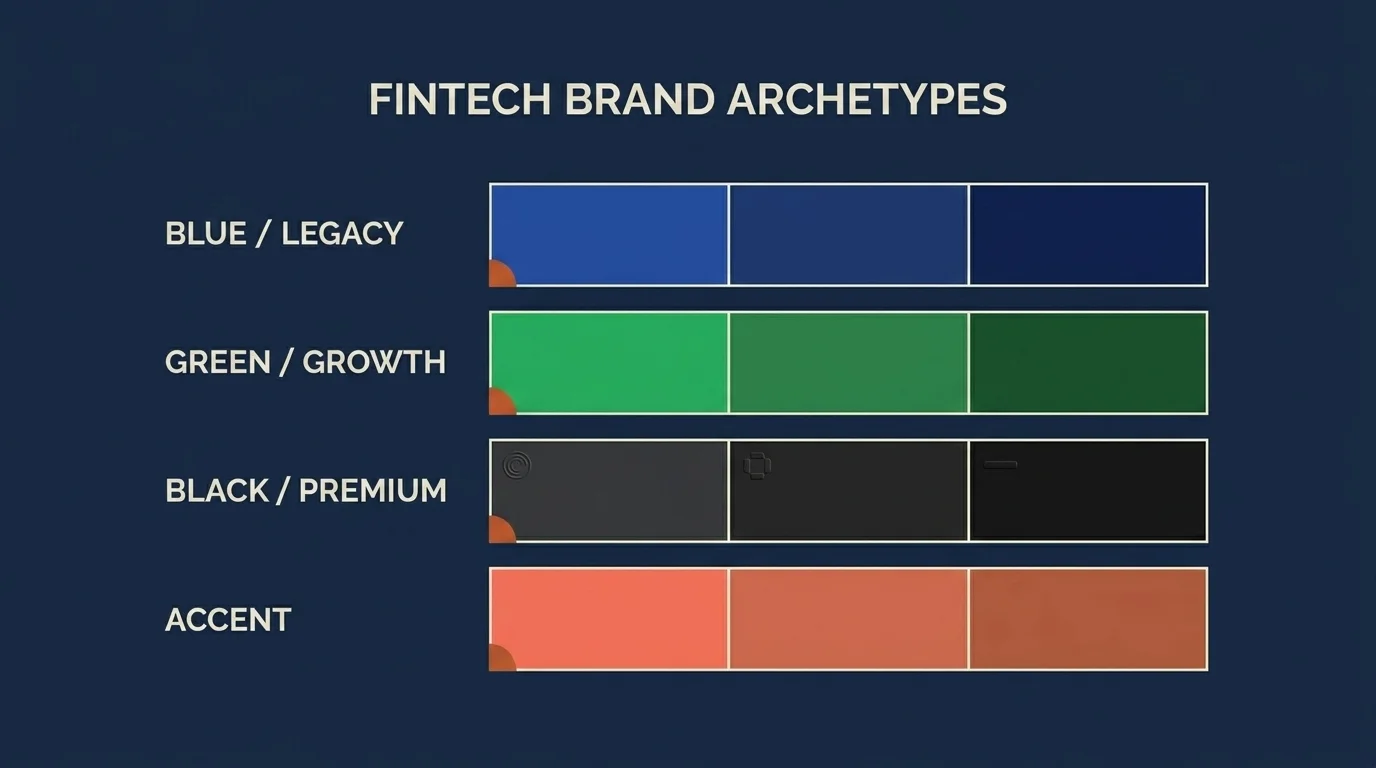
The fintech brand archetype matrix
Twelve fintech brands, four archetypes, one observation about which colors survive scrutiny.
| Archetype | Brand | Anchor color | Read |
|---|---|---|---|
| Blue / legacy trust | Vanguard | Navy | Institutional, long-horizon, low-cost passive |
| Blue / legacy trust | Charles Schwab | Cobalt | Brokerage heritage, retail-friendly |
| Blue / legacy trust | JPMorgan | Navy | Universal bank, full-stack credibility |
| Blue / legacy trust | Coinbase | Bright blue | Trying to import legacy-bank trust into crypto |
| Blue / legacy trust | PayPal | Two-tone blue | Payments-rails ubiquity |
| Green / growth | Acorns | Forest green | Compound-growth narrative, micro-investing |
| Green / growth | Public | Black + green accent | Growth signaling with premium restraint |
| Green / growth | Robinhood (pre-2022) | Bright green | Growth + commission-free disruption |
| Black / premium restraint | Apple Card | Titanium / white | Premium hardware-grade brand transfer |
| Black / premium restraint | N26 Black/Metal | Black | Restraint as the trust signal |
| Black / premium restraint | Revolut Metal | Black | Tier above default cobalt fintech |
| Personality accent | Monzo | Hot coral | Personality differentiation on top of underlying trust signals |
The reason the matrix is worth drawing is that it shows what dominant strategy actually looks like at scale. Adobe research finds 54% of consumers identify blue as the most trusted brand color, and 33% of top global brands use blue in their logo. When the largest installed-base fintech (PayPal), the largest legacy broker (Schwab), the largest discount broker by AUM (Vanguard), and the largest US-listed crypto exchange (Coinbase) all anchor on the same color, the data is telling you something. Blue is the default trust signal that financial services has converged on for forty years.
But notice the second column. The green-archetype brands are aiming at growth rather than legacy trust. The black-archetype brands are aiming at premium positioning by deliberately not using the default color. And the personality-accent brands are aiming at differentiation within an underlying trust-signaling palette. None of these are aesthetic choices. They are positioning choices, and the color is a marker of where the brand is targeting on the trust/growth/premium spectrum.
The analytical question to carry through the rest of this article is whether those positioning choices correlate with sustainable business outcomes — durable revenue, defensible margin, repeatable unit economics — or whether they are short-cycle marketing artifacts that the market eventually re-prices.
The bull/bear red-green contamination problem
There is a structural conflict in finance brand-color logic that no marketing blog I have read addresses head-on, and I think it is the single most underrated point in this entire topic.
Red, in marketing creative, codes for urgency and high-arousal action — buy now, limited time, act fast. That is the textbook reading. But red, in any trading interface in the Western financial system, codes for loss — a stock down on the day, a portfolio in the red, a P&L in the negative. Green, conversely, codes for gain. This convention is universal in US, European, and most global trading UIs, and it is internalized at almost-reflexive depth by anyone who looks at financial data for a living.
The implication is that any fintech platform that runs both marketing creative and a chart-bearing app is operating in a brand environment where red carries two contradictory meanings simultaneously — "act now" in the ad, "your money is gone" in the product. The conflict is not abstract. A buy-now CTA in red on a brokerage app sits next to a portfolio panel where red is bad. This is one structural reason that consumer fintechs have, for the past decade, defaulted away from red as a primary brand color even though the marketing-psychology literature would otherwise endorse it.
The exceptions are mostly outside the consumer brokerage space — Vanguard's institutional materials use a navy + red palette without conflict because there is no chart-bearing consumer surface to contaminate, and trading-data providers (Bloomberg's terminal in particular) operate with their own brand color systems that are intentionally chart-adjacent. For consumer fintech, the red-green trading convention is a hard constraint on brand-color decisions that the marketing literature has not yet caught up to.
The complicating factor is that red-green is itself a problematic encoding for accessibility, which I will get to.
The post-blue thesis: why premium fintech is moving to charcoal, teal, and forest green
The dominant 2024-2026 shift in fintech brand color is what I will call the post-blue thesis. The argument is that blue has become so saturated as the default fintech trust signal — to the extent that 33% of major global logos use it — that the differentiation value at the margin is now negligible. The next-tier premium fintech brands are signaling trust not by adopting the default color but by deliberately moving away from it toward dark neutrals (charcoal, black), teal, and forest green. The mechanic is restraint-as-trust-signal: in a market where everyone is blue, the brand that abstains from blue reads as confident enough not to need the crutch.
The evidence is concrete. N26's black-and-white aesthetic on its premium tiers; Apple Card's titanium hardware-influenced palette; the wave of numberless card designs from Chime, Brex, and Mercury using minimal-color physical card aesthetics; Revolut Metal's black positioning above the default-cobalt mass-market tiers. The common reading across these brands is that they have decided their differentiation comes from positioning premium against the saturated mid-market trust signal, not from playing inside it.
A parallel current is the emergence of earthy and muted palettes — clay, terracotta, olive, ochre, sand, muted greens — in 2026 finance branding. The earthy palette tracks closely with ESG-positioned investment platforms and sustainability-themed funds: the color signal is grounded, natural, "authentic" — designed to communicate that the platform's product is differentiated from conventional finance, not just packaged differently.
The third current is what I will call personality-accent layering. Once a fintech has anchored its primary trust signal (blue, black, or earthy), a Tier 3 personality color like Monzo's hot coral or Revolut's gradient experimentation is now standard practice for differentiation without compromising the underlying trust signal. The trust color carries the weight; the personality color earns the recall.
I am not going to say which approach is right. I will say this. Brand color choices that follow durable underlying business positioning — Vanguard's institutional palette tracking its institutional discipline, N26's restraint palette tracking its premium proposition — tend to survive multi-year cycles intact. Brand color choices that follow brand-fashion currents tend to be re-done within five years. The analytical signal is whether the color decision is downstream of the business decision or substituting for it.
Color localization for global investment platforms
A specific operational issue that no top-3 SERP competitor addresses with finance specificity is color localization. Sevenkoncepts notes that smart global fintech brands now treat color localization as seriously as linguistic localization — not in the sense of redesigning per market, but in the sense of auditing which colors carry dangerous unintended meanings in each operating jurisdiction.
The cleanest example is the one that maps directly onto the bull/bear contamination problem. Red in Western trading UIs codes for loss; red in Chinese consumer culture codes for prosperity, luck, and celebration — to the extent that the Shanghai and Shenzhen stock exchanges use red for up and green for down, the inverse of the Western convention. A US-listed fintech that expands into mainland China carries a brand-color stack that is, depending on context, simultaneously signaling "loss" and "prosperity" — and the consumer-facing brand creative requires localization decisions that go well beyond translating the copy.
The same dynamic applies to white (purity in the West, mourning in much of East Asia), gold (luxury in Western markets, ceremonial in others), and the broader palette of colors that carry strong cultural associations. The honest read for any global investment platform is that color localization is now part of the launch-readiness checklist, not an aesthetic indulgence.
Accessibility as a trust signal
The accessibility argument used to be framed as a compliance argument — meet WCAG AA on contrast, satisfy the floor, move on. The 2026 framing has shifted: accessibility is now a measurable trust and conversion signal in its own right.
Ads with 7:1 or better contrast ratios show roughly 23% better readability and 15% higher conversion than minimum-standard ads. The interpretation is straightforward — higher-contrast creative is read more accurately by more people, including people whose eyesight is age-related or environment-degraded, and the comprehension lift translates into the funnel. For a regulated financial product where the legal-risk surface includes whether the consumer actually understood the disclosure, contrast is a fiduciary-adjacent design constraint, not a checkbox.
The bull/bear red-green encoding compounds the issue. Approximately 10% of the population has some form of red-green colorblindness, which means any trading UI that conveys gain-versus-loss through color alone fails for roughly one in ten users. The platforms that have addressed this (Public, Robinhood post-redesign, Schwab's institutional product) now pair the color with a redundant non-color signal — an up-arrow / down-arrow, an explicit "+" or "-", a directional triangle — so that the color is decorative reinforcement of an already-encoded signal rather than the signal itself.
This is the kind of decision that does not show up on a marketing-blog brand-color chart but matters enormously to a financial product. It also serves an SEO point worth naming: accessibility-driven brand-color discipline is the closest thing to a defensible competitive moat in this space, because it requires sustained operational commitment rather than a one-time logo decision.
Color meanings in finance — a working table
Pulling the threads together as one table for reference.
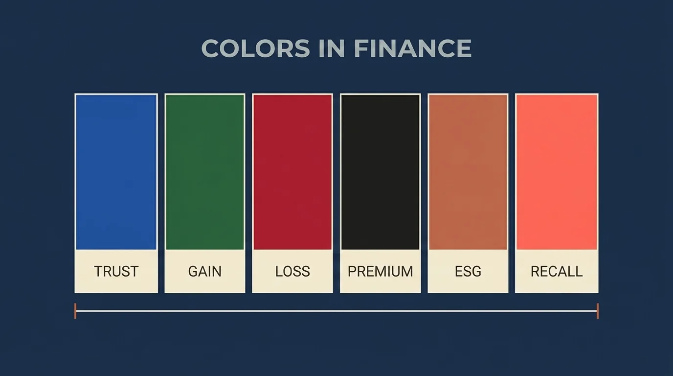
| Color | Finance association | Marketing use | Risk in trading UI | Example fintech |
|---|---|---|---|---|
| Blue | Trust, institutional credibility, stability | Default brand-trust signal; saturated | Neutral / no UI conflict | Vanguard, Schwab, Coinbase, PayPal |
| Green | Growth, optimism, gain | Growth-stage and disruption brands | Codes as "up / gain" in Western UIs | Acorns, Public, Robinhood (pre-2022) |
| Red | Urgency, action, alertness | High-arousal CTAs | Codes as "down / loss" — conflicts with marketing read | Rare as a primary brand color in consumer fintech |
| Black | Premium, restraint, exclusivity | Tier-above-default positioning | Neutral / no UI conflict | N26 Metal, Apple Card, Revolut Metal |
| Forest green / earthy | Sustainability, ESG, authenticity | Differentiation from saturated blue, ESG signal | Largely neutral | Emerging 2026 ESG-positioned platforms |
| Personality accent (coral, gradient) | Differentiation on top of trust palette | Tier 3 recall signal | None — used in marketing only | Monzo, Revolut accent layers |
The table is a tool for thinking, not a recommendation. The color-choice question for any specific platform is downstream of the positioning question, not upstream of it.
On gender and color (revised)
A version of the previous draft of this article leaned on the once-fashionable "red appeals to men, blue appeals to women" generalization. The 2026 evidence does not support framing the brand-color decision in those terms. The HubSpot survey work reports that 57% of men and 35% of women rank blue as their favorite color — a cross-demographic preference rather than a gender-specific one. Blue's role as the dominant finance trust signal works across the population, not against one half of it. Any brand strategy that builds an investment platform's primary visual identity on a gender-bisected color preference is fitting a 2010-era frame onto a 2026 audience.
A more defensible reading is that color preferences vary materially by age cohort, income segment, and cultural background — segments a brand can actually identify and serve — and that primary brand color decisions should follow the platform's positioning rather than a gender split.
A short decision-flow
For a fintech evaluating its own brand-color stack — or for an investor evaluating whether a fintech's brand-color decisions look durable.
- If the platform is positioning on institutional trust and long-horizon scale → anchor on navy or cobalt blue; the saturation is the trust signal.
- If the platform is positioning on growth, disruption, or compounding-narrative → green as anchor or accent; recognize the conflict with the trading-UI green-as-gain convention and resolve it deliberately.
- If the platform is positioning premium above the default-cobalt mass-market tier → black, charcoal, titanium-influenced palette; restraint is the differentiator.
- If the platform is positioning on ESG, sustainability, or "grounded authenticity" → earthy palette, forest green, muted neutrals.
- In every case → use a Tier 3 personality accent for recall; ensure WCAG 7:1 contrast for readability; pair red/green trading signals with redundant non-color encoding for colorblind users.
The flow is a tool for stress-testing whether a brand-color decision is downstream of business positioning or substituting for it. The latter is the failure mode.
What would change my mind on the post-blue thesis
I want to close on what I would actually watch for, because the analytical framing of this article rests on one specific assumption: that the next decade of premium fintech will continue migrating away from the saturated blue trust signal. Two specific signals would invalidate that assumption.
The first would be a sustained re-adoption of cobalt-default branding by a new top-five US fintech launching after 2026 — a cohort that has chosen to position inside the saturated blue field rather than against it. That would suggest the differentiation cost of the default has fallen below what I currently estimate.
The second would be measurable underperformance in conversion or retention metrics for the post-blue brands relative to their cobalt-default peers, sustained for two consecutive product-quarter reporting periods. A single bad quarter is noise — the brand-color literature is too imprecise to read anything into one cycle. Two consecutive quarters of underperformance would tell me the restraint-as-trust signal is not landing with users at the rate the literature claims.
Until those signals arrive, the working position is that brand-color decisions downstream of durable business positioning compound, and brand-color decisions following marketing-fashion trends decay. As ever, none of this is individual financial advice or a recommendation on any specific platform. The analytical frame is the work. The investment decision belongs with a licensed advisor who can see the parts of your situation that no general article can address.
Frequently Asked Questions
Vanguard, Charles Schwab, JPMorgan, Coinbase, and PayPal anchor on blue as their primary brand color to signal trust, institutional stability, and long-horizon credibility. Adobe research shows that 54% of consumers identify blue as the most trusted brand color, and roughly 33% of top global brands use blue in their logo. Blue is the default trust signal that consumer financial services has converged on over the past four decades.
The saturation of blue as the default fintech trust signal has reduced its differentiation value at the margin. Premium fintech brands — N26 Metal, Apple Card, Revolut Metal, and the numberless-card aesthetics from Chime, Brex, and Mercury — are positioning above the default-cobalt mass market by deliberately moving to dark neutrals, charcoal, and forest green. The mechanic is restraint-as-trust-signal: in a market where everyone uses blue, the brand that abstains from blue reads as confident enough not to need the crutch.
In Western trading UIs, red codes for loss and green codes for gain. This convention is universal across US and European brokerage platforms and is deeply internalized by anyone who looks at financial data. The result is a structural conflict for any consumer fintech that runs both marketing creative and a chart-bearing app: red carries two contradictory meanings simultaneously — 'act now' in the ad versus 'your money is gone' in the product. This is one structural reason consumer fintechs default away from red as a primary brand color even though the broader marketing-psychology literature would endorse it.
No. Red signals prosperity, luck, and celebration in Chinese consumer culture — the Shanghai and Shenzhen stock exchanges use red for up and green for down, the inverse of the Western convention. White signals purity in the West but mourning in much of East Asia. Gold reads as luxury in Western markets but ceremonial elsewhere. Global fintech brands now treat color localization as part of launch readiness rather than an aesthetic indulgence.
Two reasons. First, ads with 7:1 or better contrast ratios show roughly 23% better readability and 15% higher conversion than minimum-WCAG-AA standard ads — for regulated financial products where the disclosure must actually be understood, contrast is a fiduciary-adjacent design constraint. Second, approximately 10% of the population has some form of red-green colorblindness, which means any trading UI that conveys gain-versus-loss through color alone fails for roughly one in ten users. The platforms that have addressed this pair the color with a redundant non-color signal (arrow, plus/minus, triangle).
In marketing creative, red codes for urgency, alertness, and high-arousal action, while blue codes for trust, stability, and institutional credibility. Both readings are textbook. The complication in finance specifically is that red also codes for loss in any chart-bearing trading interface, which conflicts with the marketing read on the same platform — so red is rare as a primary brand color in consumer fintech.
Red signals heightened arousal and short-time-frame action, which can read either as opportunity or as warning depending on context — in a trading UI it codes specifically for loss. Blue signals stability and longer-horizon thinking, which aligns with how most retail investors describe their preference for trustworthy financial relationships. The cross-demographic preference for blue (HubSpot: 57% of men and 35% of women favor blue) makes it the default trust anchor across the population, not a gendered choice.
Investment products are sold on a relationship that survives multi-year holding periods, and the brand color is one signal a consumer carries forward across that relationship. Color-based brand recall is 79% after 180 days of no exposure against 28% for name recall — consumers remember brands by color far longer than by name. For a financial product that asks consumers to keep capital in place across full market cycles, the durability of the trust signal is itself a competitive variable.
Check Out These Related Articles

Finance Mentor vs Sponsor: What Actually Compounds a Career

Youth-Led Financial Revolutions: Crowdsourcing as a Catalyst for Investment Innovation

The Psychology Behind Investment Risk-Taking Behavior Among Millennials